Displaying coincident points
By Charlie Frye, Esri Chief Cartographer
We’ve had a number of folks writing in on Ask a Cartographer wondering how to displace or offset coincident points so all the points could be seen. Data with coincident points is most commonly produced as a result of geocoding addresses. There are at least two ways to handle displaying this data. One would be to create a graduated or proportional symbol thematic map, and to do that the input point data would be processed with the Collect Events tool, which would produce output containing points that represented the locations and an attribute that indicated how many points were at that location.
This entry will explore another route. First, there’s no geoprocessing tool, yet, that will automatically displace or scatter points around their original locations. In fact, the problem is a cartographic problem because the size of the marker symbol that represents the points must be factored into the solution. Since the Maplex Label Engine could displace labels and do so such that conflicts were avoided, I figured it could also be used for the task of displacing points; I was right, and here’s how I did it:
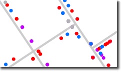
About my data and initial layer symbology—it’s geocoded voters and the result is that households with multiple voters have points stacked at the same location. The image above shows a sampling how how that data looks when symbolized with unique values based on political party affiliation.
- The trick to using Maplex for this problem is to first set the layer’s symbols to have a size of 0, and set their color to no color (note: if your layer uses simple marker symbols, be sure to turn off the outlines by setting them to no color). The idea is that we are going to label the points with a symbol rather than draw a symbol in the usual way.
- Assign label classes based on the symbols defined for the layer. In my case I have label classes for Democrat, Republican, No party affiliation, and Other.
- The way the text symbol is defined the key. The text symbol’s background background will be the defacto symbol for each point. The Maplex Label Engine will place the first label on its point’s location and then displace subsequent labels for that location nearby. To set up your text symbol follow these steps:
- In the Label Manager dialog open text symbol properties for one of your label classes, show the Advanced Text tab
- Check the Text Background property.
- Click the Properties button that just became enabled.
- Change the Type (at the top) to Marker Text Background.
- Pick the symbol you want; I used the symbol that was originally assigned to my layer’s symbology for that class.
- For Maplex settings used the following:
- Position should be “Best Position”
- Turn off stacking (I’m assuming it will go faster by doing this)
- In Placement Properties dialog, on the Label Position tab, click Label Offset button and set the Distance to be 0.25 points and the Maximum to 3000 percent of that distance. (This allows an offset value to be in play, so to speak, and the maximum % distance, in this case is 7.5 points to be used to place subsequent points. This is interesting insofar as the relationship with the geocoded points’ offset from the street–so do what makes sense here in terms of keeping points on the correct side of the street, if that is important for your map; in fact you may want to re-run the geocoding operation just to apply a larger value for the Side Offset property by modifying the locator properties when you run the Geocode Addresses process.)
- In Placement Properties dialog, on the Conflict Resolution tab, set the Label Buffer (bottom) to be 1% (the default is 15%)–this will allow the labels to be placed in close proximity to each other–also freeing up space for more labels to be placed.
- On the labeling toolbar, also set the Placement quality to Best, rather than Fast.
Of course there’s a limit to what can be done here. Displacing more than say a dozen points is likely an unrealistic expectation, but for 2-10 points, this method seems to work rather well. Here are some of my results:
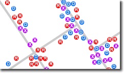 | 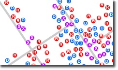 |
| This is the dispersed representation for the points drawn as labels — now you can see all of the data, and the points also stay on the correct side of the streets. | Here, the percentage for offset was increased to 25000% — the label placement generally ignores the side of the street, but the impact on the dispersion of the points is rather noticeable as you can now see each individual point really clearly. |
In both cases these results are from the same data. This example serves to show that it’s important to check your data to see just how many points are at each location. This is another place the Collect Events tool can be put to use.